4 Color Rules To Look Out For When Decorating Your Home
Understanding the Importance of Color Harmony in Home Design
Color is one of the many characteristics we perceive when we see something. This perception is due to the ability of the eyes to sense light. Color is the part of light our eyes sense. The color of an object is such that, whatever color we sense from an object is the part of the spectrum of light reflected from that object i.e. a blue object reflects light from the blue region, a red object reflects light from the red region, black objects absorb light from region of light and white objects reflect all region of light.
All colors stem from 3 colors – blue, red and yellow – these colors are called the primary colors and from the primary colors, other colors (secondary and tertiary colors) are derived. One of the importance of colors is the physical appeal on the eyes. This physical appeal is only achieved when colors are handled appropriately, misusing colors will usually lead to very unattractive designs and it could make even the most sophisticated items look basic.
The effect of colors goes beyond just being physically attractive because colors may also affect the psychological inclination of a person. Colors can influence people’s moods – causing people to feel melancholic, unmotivated or elated. Also, colors can define the impression about people or items – using a dull color to design the interior of a home may cause people to perceive the people of the home as being gloomy. It is therefore essential to work with the right colors in designing anything, including the interior of the home.
Working with colors is quite tough because there are so many intricacies to beat to make the right selection. Colors come in different shades and to combine the different shades of each color can be tasking and even confusing. Yet when colors are combined, they must be consonant else they would not be alluring.
The good thing, however, is that there are rules that guide the use and selection of colors when designing the interior of a home. We examine 4 of these rules in the subsequent paragraphs of this article. The following are 4 color rules to be followed in interior designing:
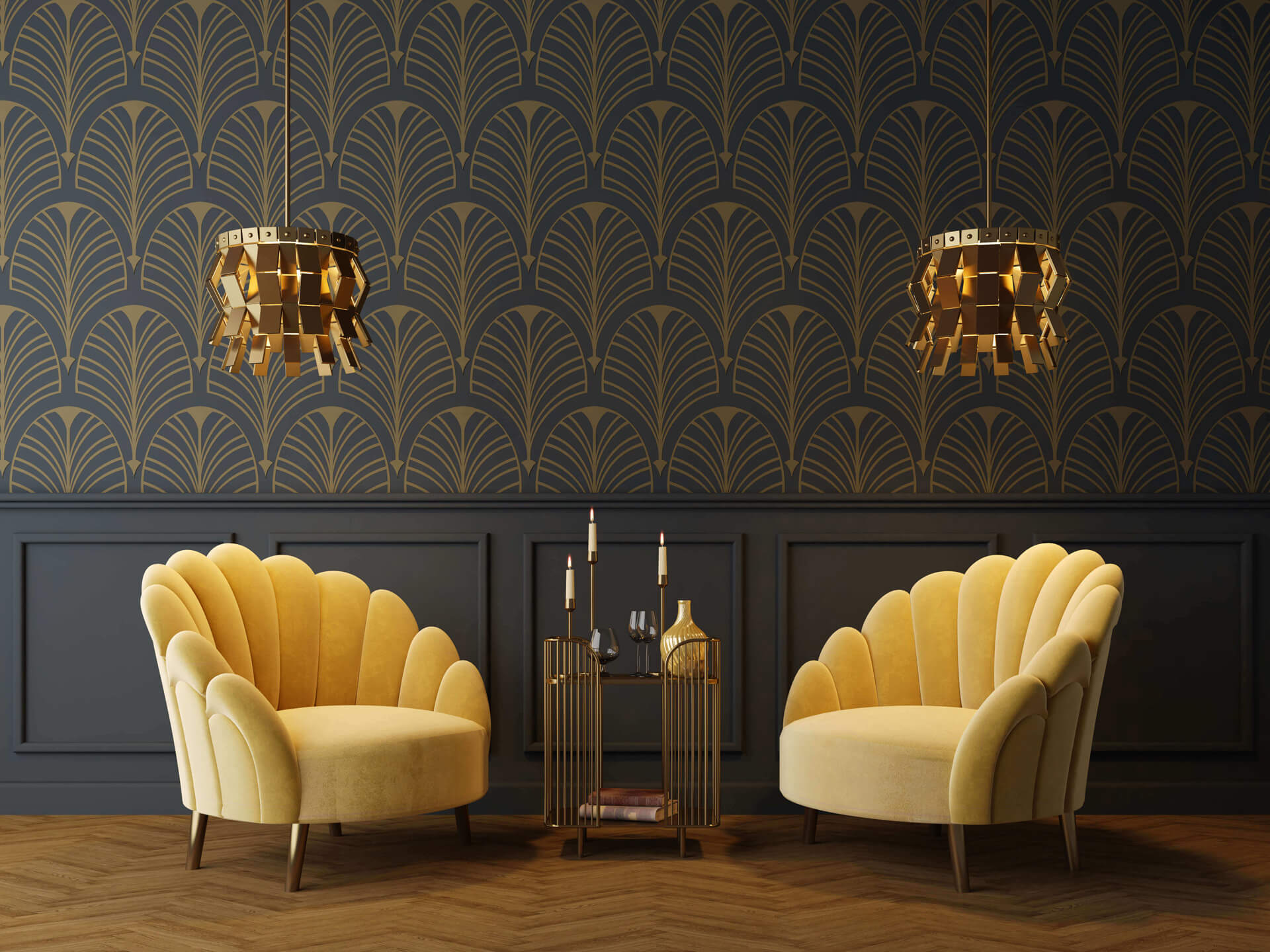
The 60: 30: 10 rule
The 60: 30: 10 rule is perhaps the oldest and most common rule in interior designing. This rule involves using 3 colors of varying shade in different proportions and aims to create a balance between these colors. It can be used in so many situations irrespective of individual inclinations. Once you grasp the concept of the 60: 30: 10 rule, choosing the colors and designing becomes very easy.
Each value of the rule represents the proportion (in percentage) each of the colors should cover in the design. The prominent shade will take up about 60 % of the room and this could be the walls, the floor, the floor covers, and the furniture. The 60% shade acts as a template for the other 2 colors to be used. Generally, the 60 % color is the lightest of the 3 colors.
The 30 % is for the next color, the secondary color, which takes about half the space the prominent color takes. The 30% color is usually darker than the 60% color and contrasts with it. The 30% color adds dimension to the design.
The 10% color represents the color with the least proportion in the design. This color, called the accent color, will have a presence 3 times less than the 30% color and 6 times less than the 60% color. The accent color creates further dimension to the design – it creates contrast and gives rhythm to the design.
SPECIFIC ITEMS/EXAMPLES FOR THE 60-30-10 RULE:
60%
- Walls
- Accent Pieces
- Rugs
- Sofa
- Large “Foundation” Pieces
30%
- Curtains
- Painted Furniture
- Side Chairs
- Smaller “Foundation” Pieces
10%
- Throw Pillows/Patterned Fabrics
- Decorative Accessories
- Artwork
The Color Wheel
The color wheel is a circle of color hues that illustrate the relationship between the colors. It contains the 3 primary colors, the 3 secondary colors and 6 tertiary colors. Asides the 60: 30: 10 rule, 3 rules are based on the color wheel. These rules are the analogous color rule, the complementary color rule, and the color warmth rule.
The Analogous color rule
In the analogous color rule, you choose a color on the 12-shade color wheel and then choose 2 other colors on either side of it. These 3 colors are called analogous colors because they are a bit similar. For instance, on the color wheel, one may select blue, blue-green and green as the 3 colors for the design – these 3 colors are similar and they are beside each other on the color wheel thus they are analogous colors. These 3 colors may be a combination of primary, secondary and tertiary colors, 2 tertiary colors and 1 primary color or 2 tertiary colors and 1 secondary color. Select THREE colors adjacent (next) to each other on the color wheel, having the middle color being the more dominant color. An example of this would be blue-green, green, and green-yellow; do you see how green is showing up in all three?
After selecting 3 analogous colors from the color wheel, one may then use the 60: 30: 10 rule to decide the quantity and distribution of each color.
Warm vs. Cool Colors
As earlier mentioned in the introduction, colors go beyond the physical as they also stir psychological feelings. Some colors are thought to be warm and vibrant because of the intensity of their shade while some are thought to be cool for the same reasons. Colors like orange and red are considered warm and blue, grey and green are considered cool.
Generally, the warm colors are thought to be more suited for lively spaces – the living room, the dining room – where they create a cheery aura. On the other hand, cool colors are better in spaces where the aura is expected to serene – like offices and bedrooms.
The Complementary color rule
Unlike the other rules, the complementary color rule works with just 2 color shades. These 2 color shades are complementary and they are located directly opposite each other on the color heel. Select TWO colors opposite from each other on the color wheel. One will always end up being a “warm” color and the other will be a “cool” color giving you a nice balance.
The 2 colors – like red and green; blue and orange – are highly contrasting and should not be used too much. When 2 complementary colors are used in interior decoration, it is desirable to add a neutral color (such as white, grey, black and silver) as the accent color. Following the 60: 30: 10 rule would be useful in this rule too.
Conclusion
As you go from designing one room to the other, one can switch color schemes however, it is necessary to ensure that the color scheme of each room is compatible with the others to ensure harmony even in the diversity.
