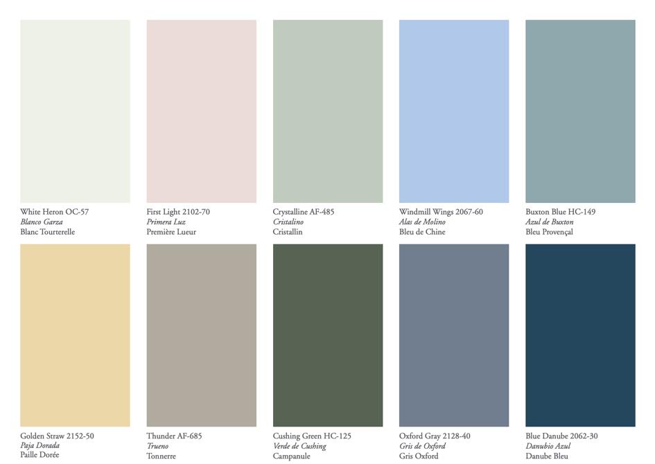
The color palette of the year 2020

According to the Benjamin Moore Color of the year, there are ten beautiful colors on the color palette of the year and here they are.
White heron: This belongs to the off-white family of colors. While the color whites in its full pure form might seem a bit too bright and invasive albeit sophisticated, the color white heron gives off the feeling of sophistication that comes with the white color, but it also gives a cooler feeling than white in its original hue gives. A white heron is one of the 152 white and off white colors of the off-white collection. It’s no surprise that it embodies the beauty and the sophistication of white and the warm and comforting nature of the off-white. This color on your wall turns your home into a serene environment as it induces a feeling of calm and tranquility.
First light: This can be used in place of white, or beige. It is pink, but a soft version of pink. The kind that makes living space look like the sky with a receding rainbow. It is calm, and warm, and gives a welcoming feeling to just any space it is painted on.
Crystalline: This is a color that instills confi dence as it does calm. The hue is gotten one of the 144 colors from the affinity collection. More than the feeling of calm it instills in a living space, it also fits blends beautifully into other colors on the affinity palette, if a mixture is something you had in mind. It makes a good wall painting on its own anyway.
Windmill wings: This is an extraordinary color, as it was gotten from a mixture of different bold colors. Bold colors have a way of lightening up the environment and inducing brightness. This color does all of that and still stays warm. It is from the color preview and it sets simply brings life to a living space and makes it better.
The golden straw: Think of the brightness of the summer, but towards the evening, when all that’s left of a sunny day is a pale yellow that reminds you of the beauty of the day. That is what the golden straw represents. Beauty and calm.
Thunder: Just as the name implies, this instills a burst of confidences and beauty, so much that you just might not be able to get over all that beauty when you have this painting on your wall, staring back at you every time you walk into your home. The thunder is not as noisy as its name implies but it is just as confident and bold.
Cushing green: Part of Benjamin Moore’s historic collection of 199 hues. This color is timeless and ageless. Just like the rest of the colors in those collections, this color has an elegant historical feel to it. It gives a feeling of elegance, class and a touch of royalty to a living space. This color, just like the others were created with the inspiration of the historical landmarks of America.
Oxford gray: Yet another one in the color preview collection, this goes against the literal meaning of its name and pushes forth warmth and a feel-good feeling into the living space it is painted in.
Buxton blue: Another one in the historic collection. Created to give your room a feeling of class and elegance. A lot of that is needed these days if the world decides to beat you down, your home should be able to tell you that you are bigger, and this color does exactly that, and more.
Blue Danube: All that is bright and beautiful and inspires perfection. It is one of the colors from the color preview and should be allowed into the living space.
There you go, the colors of the year and the palette involved. Think it is something you want to try out? It should be. Right there in Fairfield County, Connecticut, this should be part of the plan that takes you into the new year.
